Why the World Is Better Than You Think in 10 Powerful Charts
When I published Abundance: The Future is Better Than You Think in February 2012, I included about 80 charts in the back of the book showing very strong evidence that the world is getting better.
Over the last five years, this trend has continued and accelerated.
This blog includes additional “Evidence for Abundance” that you can share with friends and family to change their mindset.
We truly are living in the most exciting time to be alive.
By the way, if you have additional ‘Evidence for Abundance’ (charts, data, etc.) that you’ve encountered,please email them to me at data@diamandis.com.
Why This Is Important
Before I share the new “data” with you, it’s essential that you understand why this matters.
We live in a world where we are constantly bombarded by negative news from every angle. If you turn on CNN (what I call the Crisis News Network), you’ll predominantly hear about death, terrorism, airplane crashes, bombings, financial crisis and political scandal.
I think of the news as a drug pusher, and negative news as their drug.
There’s a reason for this.
We humans are wired to pay 10x more attention to negative news than positive news.
Being able to rapidly notice and pay attention to negative news (like a predator or a dangerous fire) was an evolutionary advantage to keep you alive on the savannas of Africa millions of years ago.
Today, we still pay more attention to negative news, and the news media knows this. They take advantage of it to drive our eyeballs to their advertisers. Typically, good news networks fail as businesses.
It’s not that the news media is lying — it’s just not a balanced view of what’s going on in the world.
And because your mindset matters a lot, my purpose of my work and this post is to share with you the data supporting the positive side of the equation and to give you insight to some fundamental truths about where humanity really is going…
The truth is, driven by advances in exponential technologies, things are getting much better around the world at an accelerating rate.
NOTE: This is not to say that there aren’t major issues we still face, like climate crisis, religious radicalism, terrorism, and so on. It’s just that we forget and romanticize the world in centuries past — and life back then was short and brutal.
My personal mission, and that of XPRIZE and Singularity University, is to help build a “bridge to abundance”: a world in which we are able to meet the basic needs of every man, woman and child.
So, now, let’s look at 10 new charts.
More Evidence for Abundance
Below are 10 powerful charts illustrating the positive developments we’ve made in recent years.
1. Living in Absolute Poverty (1981-2011)
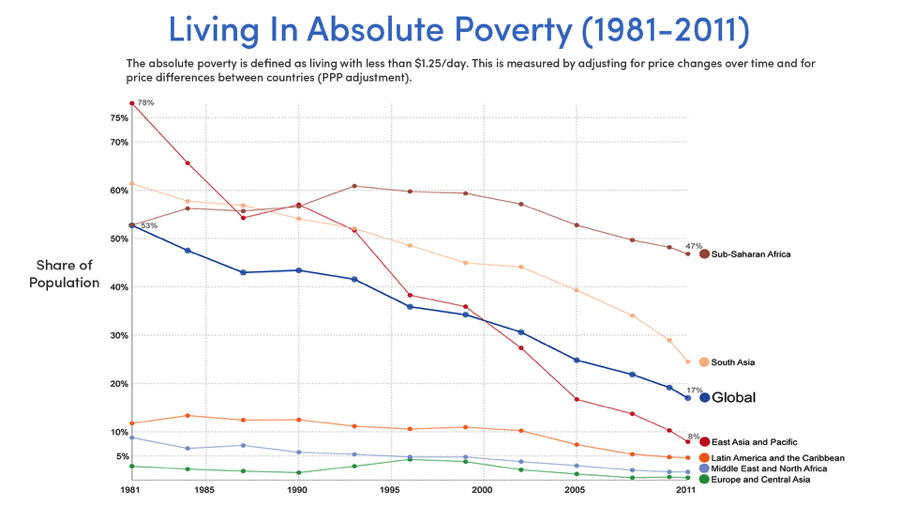
Declining rates of absolute poverty (Source: Our World in Data, Max Roser)
Absolute poverty is defined as living on less than $1.25/day. Over the last 30 years, the share of the global population living in absolute poverty has declined from 53% to under 17%.
While there is still room for improvement (especially in sub-Saharan Africa and South Asia), the quality of life in every region above has been steadily improving and will continue to do so. Over the next 20 years, we have the ability to extinguish absolute poverty on Earth.
2. Child Labor Is on the Decline (2000-2020)
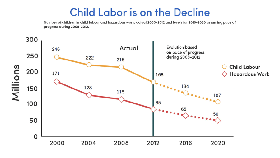
Child Labor on the decline (Source: International Labor Organization)
This chart depicts the actual and projected changes in the number of children (in millions) in hazardous work conditions and performing child labor between 2000 and 2020.
As you can see, in the last 16 years, the number of children in these conditions has been reduced by more than 50%. As we head to a world of low-cost robotics, where such machines can operate far faster, far cheaper and around the clock, the basic rationale for child labor will completely disappear, and it will drop to zero.
3. Income Spent on Food
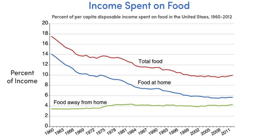
Income spent on food (Source: USDA, Economic Research Service, Food Expenditure Series)
This chart shows the percent per capita of disposable income spent on food in the U.S. from 1960 to 2012.
If you focus on the blue line, ‘Food at home,’ you can see that over the last 50 years, the percent of our disposable income spent on food has dropped by more than 50 percent, from 14% to less than 6%.
This is largely a function of better food production technology, distribution processes and policies that have reduced the cost of food. We’re demonetizing food rapidly.
4. Infant Mortality Rates
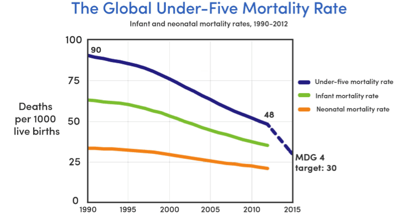
Infant Mortality Rate (Source: Devpolicy, UN Interagency Group for Child Mortality Est. 2013)
This chart depicts global under-five-years-old mortality rates between 1990 and 2012 based on the number of deaths per 1,000 live births.
In the last 25 years, under-five mortality rates have dropped by 50%. Infant mortality rates and neonatal mortality rates have also dropped significantly.
And this is just in the last 25 years. If you looked at the last 100 years, which I talk about in Abundance, the improvements have been staggering.
5. Annual Cases of Guinea Worm
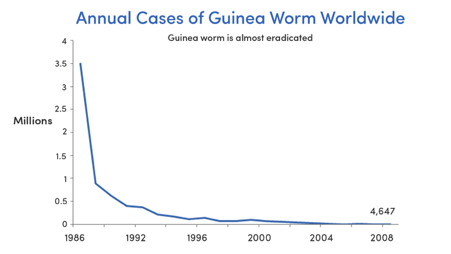
Guinea worm cases (Source: GiveWell, Carter Center)
Guinea worm is a nasty parasite that used to affect over 3.5 million people only 30 years ago. Today, thanks to advances in medical technologies, research and therapeutics, the parasite has almost been eradicated. In 2008, there were just 4,647 cases.
I’m sharing the chart above because it represents humanity’s growing ability to address and cure diseases that have plagued us for ages. Expect that through technologies such as gene drive/CRISPR-Cas9 and other genomic technologies, we will rapidly begin to eliminate dozens or hundreds of similar plagues.
6. Teen Birth Rates in the United States
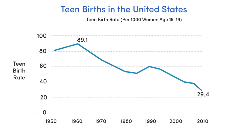
Teen birth rates (Source: Vox, Centers for Disease Control)
The chart above shows the dramatic decline in the number of teen (15 to 19 years old) birth rates in the United States since 1950. At its peak, 89.1 out of 1,000 teenage women were giving birth. Today, it’s dropped under 29 out of 1,000.
This is largely a function of the population becoming better educated, the cost of birth control being reduced and becoming more widely available, and cultural shifts in the United States.
7. Homicide Rates in Western Europe
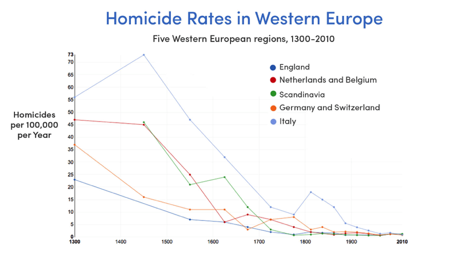
Homicide rates in Europe (Source: Our World in Data, Max Roser & Manuel Eisner)
The chart above shows the number of homicides per 100,000 people per year in five Western European regions from 1300 to 2010.
As you can see, Western Europe used to be a very dangerous place to live. Over the last 700+ years, the number of homicides per 100,000 people has decreased to almost zero.
It is important to look back this far (700 years) because we humans lose perspective and tend to romanticize the past, but forget how violent life truly was in, say, the Middle Ages, or even just a couple of hundred years ago.
We have made dramatic and positive changes. On an evolutionary time scale, 700 years is NOTHING, and our progress as a species is impressive.
8. U.S. Violent Crime Rates, 1973 – 2010
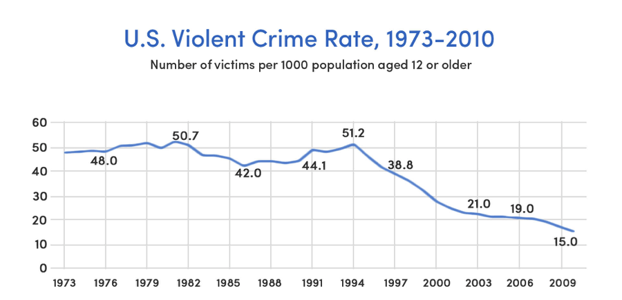
U.S. violent crime rates (Source: Gallup, Bureau of Justice Statistics)
In light of the recent terrorist shooting in Orlando, and the school shootings in years past, it is sometimes easy to lose perspective.
The truth is, in aggregate, we’ve made significant progress in reducing violent crimes in the United States in the last 50 years.
As recent as the early 80s and mid-90s, there were over 50 violent crime victims per 1,000 individuals. Recently, this number has dropped threefold to 15 victims per 1,000 people.
We continue to make our country (and the world) a safer place to live.
9. Average Years of Education, 1820-2003
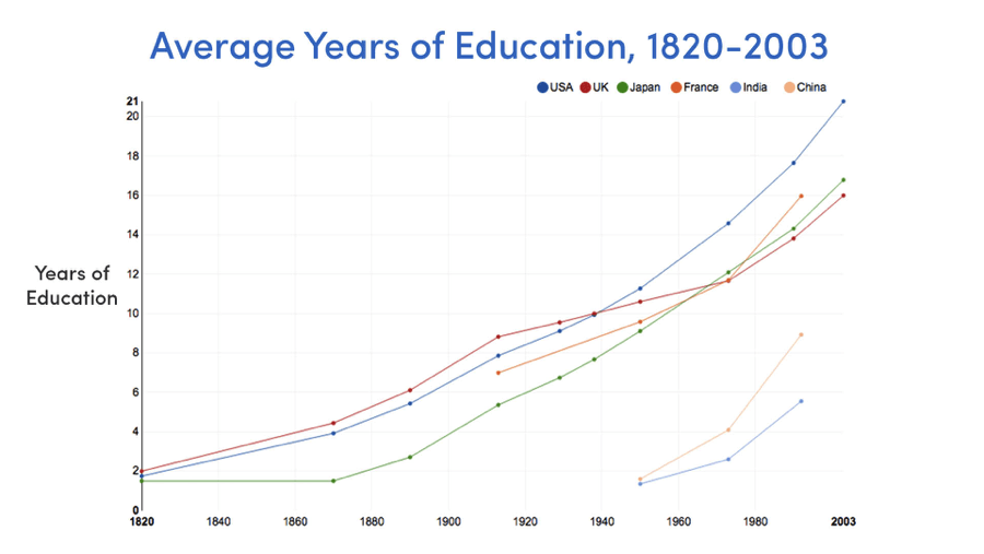
Average years of education (Source: Our World in Data, Max Roser)
I love this chart. In the last 200 years, the average number of ‘years of education’ received by people worldwide has increased dramatically.
In the U.S. in 1820, the average person received less than 2 years of education. These days, it’s closer to 21 years of education, a 10X improvement.
We are rapidly continuing the demonetization, dematerialization and democratization of education. Today, I’m very proud of the $15 million Global Learning XPRIZE as a major step in that direction.
Within the next 20 years, the best possible education on Earth will be delivered by AI for free — and the quality will be the same for the son or daughter of a billionaire as it is for the son or daughter of the poorest parents on the planet.
10. Global Literacy Rates
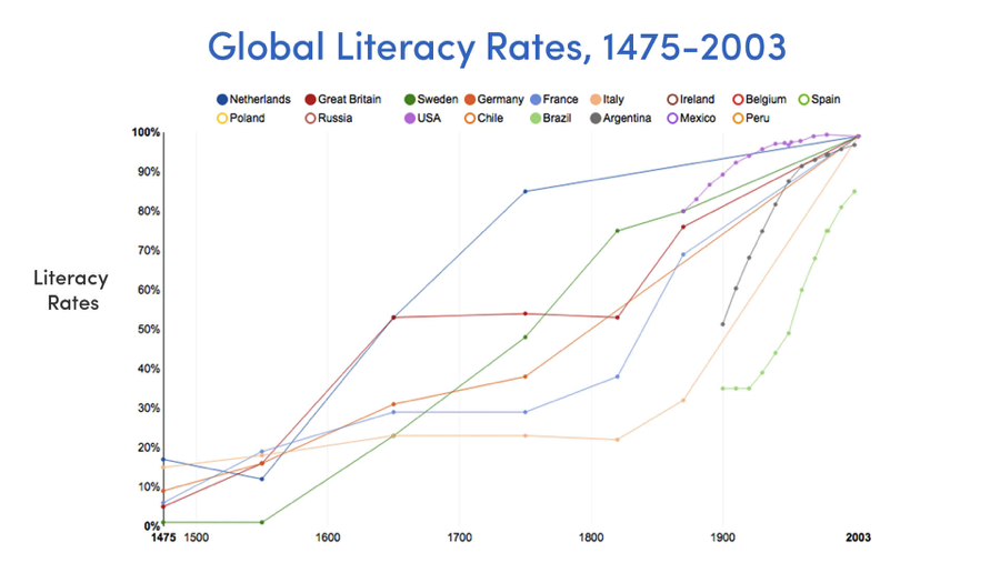
Global literacy rates (Source: Our World in Data, Max Roser)
Along those same lines, the extraordinary chart above shows how global literacy rates have increased from around 10% to close to 100% in the last 500 years.
This is both a function of technology democratizing access to education, as well as abundance giving us the freedom of time to learn.
Education and literacy is a core to my abundance thesis — a better-educated world raises all tides.
Again, if you have other great examples of abundance (charts and data), please send them to me atdata@diamandis.com.
We live in the most exciting time to be alive! Enjoy it.
Source: http://singularityhub.com/2016/06/27/why-the-world-is-better-than-you-think-in-10-powerful-charts/